Look and feel
From LimeSurvey Manual
Widgets Look'n'Feel Design Document
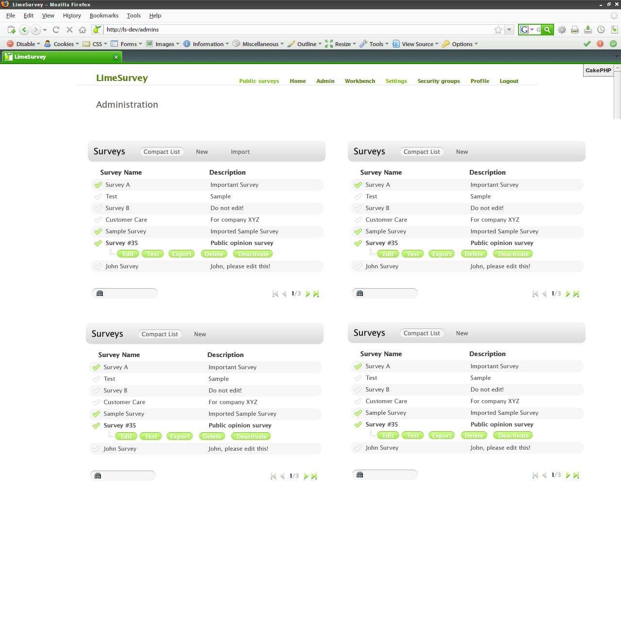
This document attempts to describe the general look'n'feel of the widgets, their interactions and workflows.
Proposal 2:
Widget Chrome: link
- content on white background, blends well with the rest of bright-coloured LimeSurvey interface
- green header, large yet inobtrusive, marks the beginning of the widget
- small arrows, indicate currently selected item and hints the user to the next navigation element.
Proposal 4:
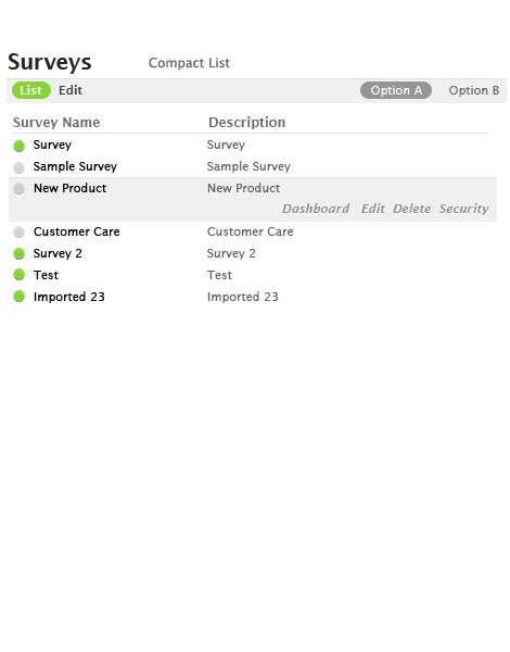
Based on proposals 3 and 3.1
Proposal 3:
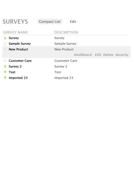
- as minimalist as possible!
- minimize the visual impact of the widget chrome, draw attention to actual contents and layout


